
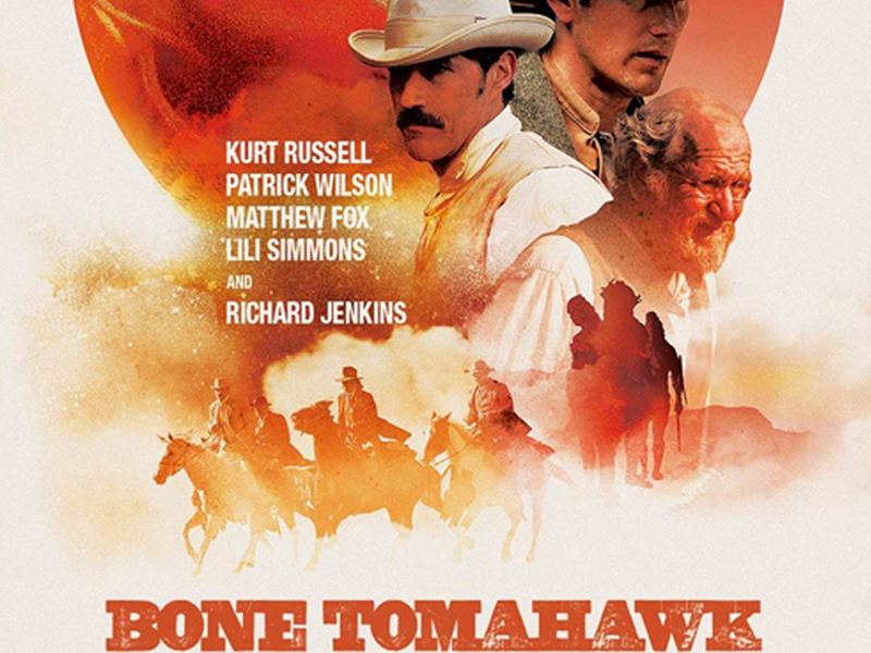
Bone Tomahawk : A Fun, Dissonant Composition
page.titles Bone Tomahawk
page.date 2016-04-01 00:00:00 +0000
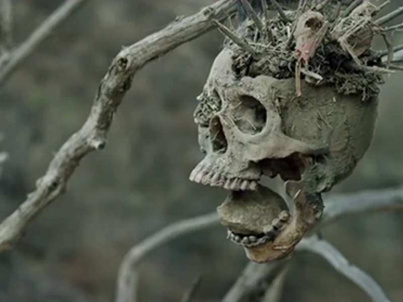
This movie rocked, and many apparently agreed with me (Rotten Tomatoes gave it a rating of 82% for critics, and 72% for audiences at the time of writing). A western horror movie? What a refreshingly novel idea, and this was acted well with a gravitas that deserves awards. (I think)
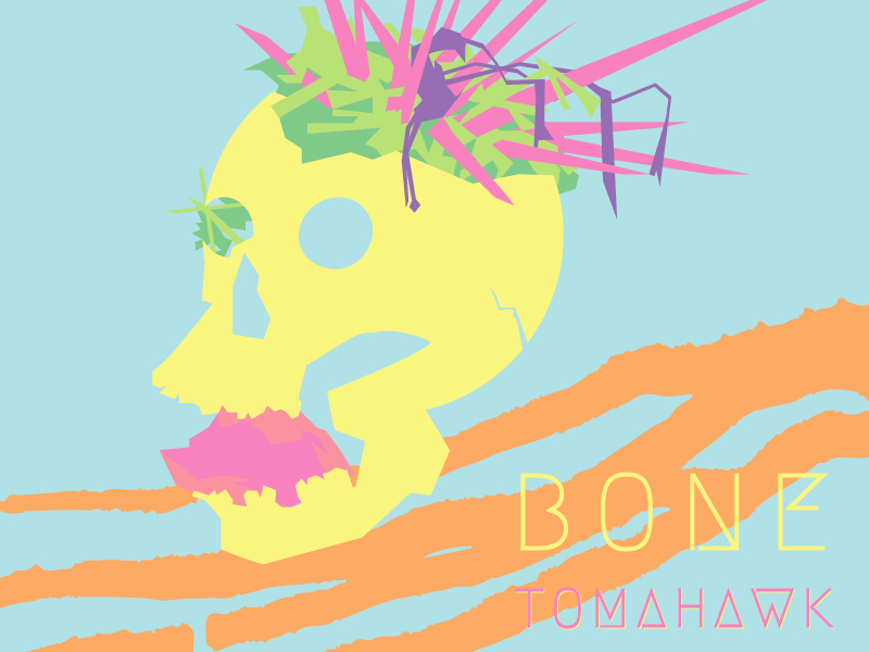
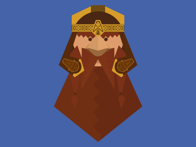
That said, I wanted to challenge myself to create an image based on the film that didn't match at all. So I decided to go with a candy, cotton-candy oriented palette. What's more dissonant than this when you consider the dark, desaturated colors you find in the film? Additionally there is something fun about creating an image that stirs up psychological dissonance arising from using typically inviting colors to portray an ominous subject.
Voila, here it is! :)


COMMENTS